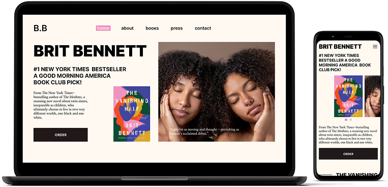
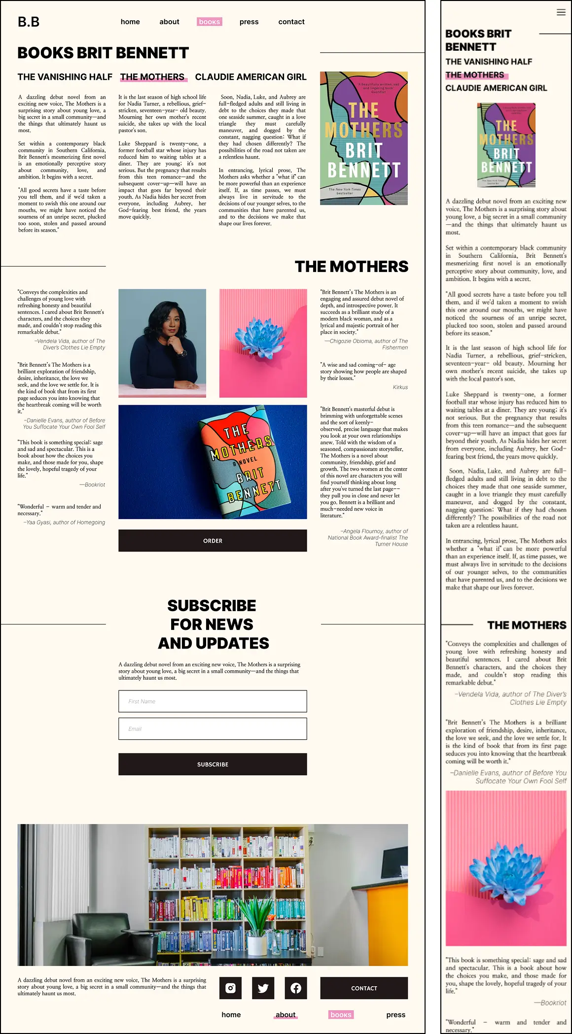
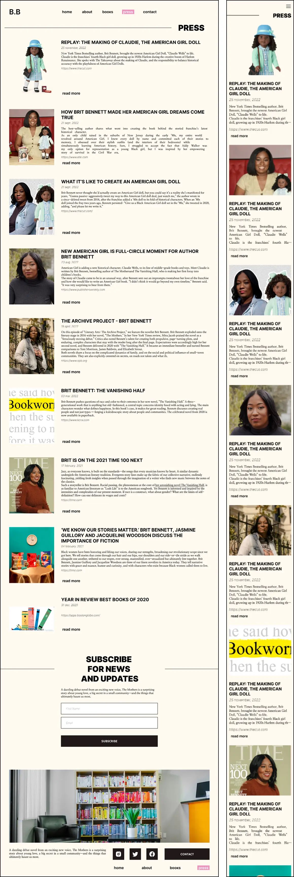
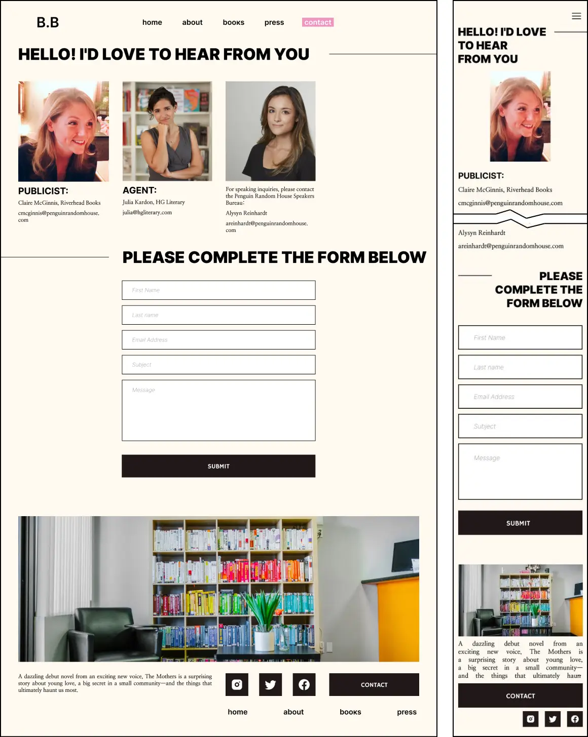
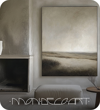
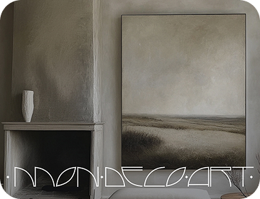
We restructured the site architecture, reduced the number of pages, and introduced a fresh visual identity with new typography and custom icons. The black-and-white palette, combined with selective use of imagery and color highlights, creates strong visual contrast and clarity. Typography choices help reinforce hierarchy and improve readability across devices.